When deciding on which courses to take next year, it is helpful to know how much work each class entails. Luckily, there are course comparison charts available on the M-A website that provide information on course content and homework load for each class. While these charts help make these course selection decisions easier, they can be very complicated.
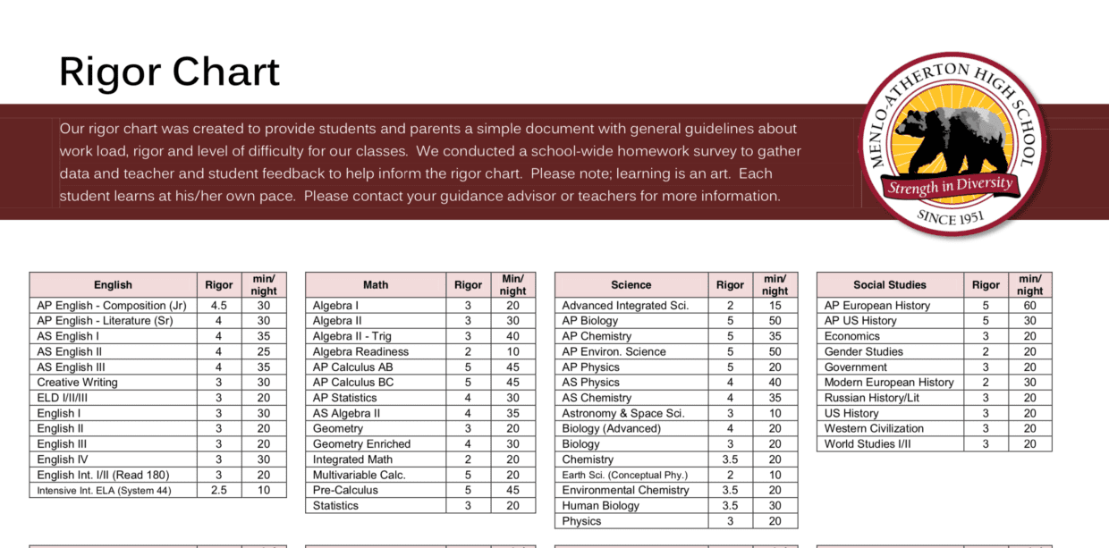
M-A used to have a rigor chart that ranked all the available courses on a scale of one to five, with one being the lowest difficulty and five the highest, but it is now outdated. It was also a flawed system because, as math teacher Michele Breen put it, “if you’re a student who’s properly placed, the class you’re in is rigorous.”
To remedy this, the subject departments have replaced the rigor chart with course comparison charts. These charts are specific to each department, allowing them to include more detailed information on each course, but they are also less consistent in how that information is presented across departments.
For example, the math department’s chart is designed to directly compare two similar classes, like Statistics and AP Statistics, or Algebra II and AS Algebra II. This allows students to place themselves on a math track that appropriately reflects their interest in math. This is the reason that there is not a full set of information for Calculus AB and Calculus BC on the math chart; there is no direct comparison that could be drawn between classes.
This differs from the science comparison chart, which focuses more on general information about each class than directly comparing two classes. It is most useful when it is used in conjunction with the science flow chart, available on the M-A website, which shows students pathways between classes they could take. There are twelve different science classes offered, and it can be stressful choosing from the wide variety of choices. Science department head Lance Powell said to “look at the flowchart first” and think to yourself, “I’ve got a choice here. If I don’t know the difference between Physics and Chemistry, I guess I could talk to my friends, but maybe we’ll come here and look at the course description [in the chart].” He added that the purpose of the system is to “give students an idea of what their options are.”
The chart for the social studies department is a combination of both styles, because the social sciences are less tracked than math but more so than the sciences. Social sciences department head and economics teacher Candace Bolles said its main purpose is to “clearly spell out the difference in rigor level and how much time and effort goes into that class” and get students to ask, “Can I do this?” She also brought up a secondary purpose, which was to “ keep the recruitment levels we have” and keep class numbers from fluctuating too much.
The English charts are similar to the social studies chart, with the only major difference being that there are separate charts for each grade which go more in depth and share books that are usually taught in each class.
Some department heads expressed concern that students are not looking at the charts. Bolles said, “I guess we sometimes wonder, are people even looking at it?” Her concern stems from the reaction of students enrolled in the AP classes, saying, “You’ll get students in AP who seem completely overwhelmed. As if they had no clue that there would be readings every night… So I kind of wonder if maybe they’re just signing up for classes because their friends are signing up for classes.”